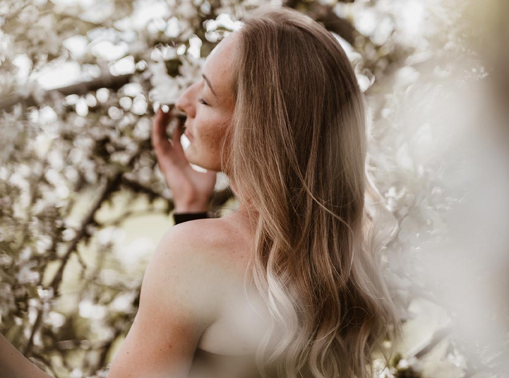
In the field of photography and design, it can sometimes be challenging to confidently combine colors that are positioned opposite each other on the color wheel as complementary colors.
Choosing the best color combination is a kind of science within the arts.
Colors have an incredible impact on our sense of aesthetics and surround us in our world. They can calm us, motivate us, or even influence how we perceive things. Perhaps the most important method for creating harmonious designs is the use of the color wheel and complementary colors.
Understanding the Color Wheel: Complementary Colors
The color wheel is a visual representation of colors and their relationships to one another. By analyzing the color wheel, designers and photographers can select the right or matching color combinations to evoke specific moods or reactions. Complementary colors, which lie opposite each other on the color wheel, create strong contrast and are particularly striking and appealing to the eye.
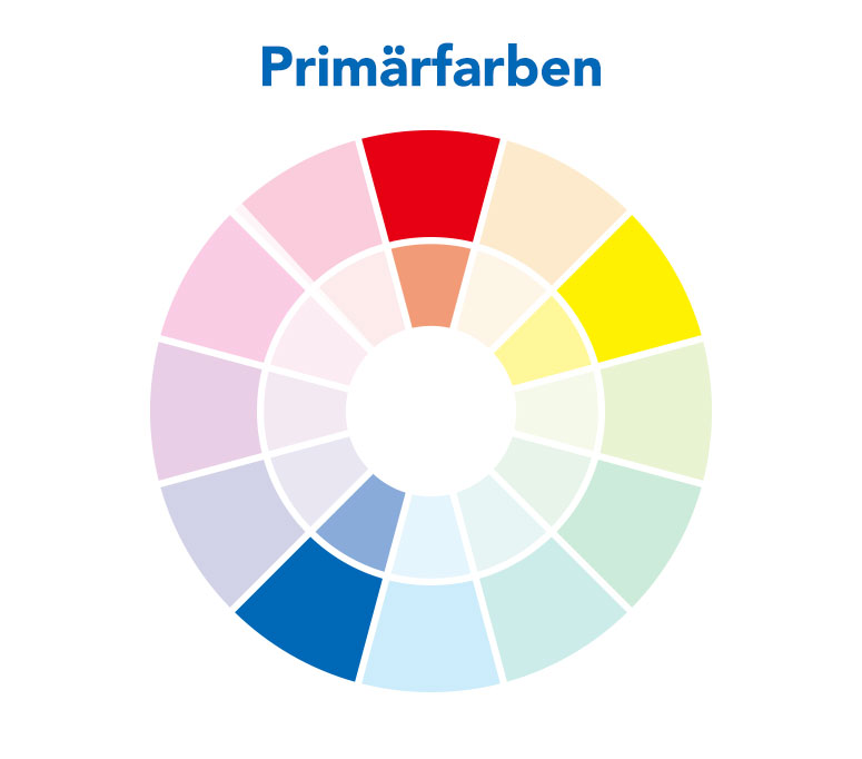
Primary Colors are the fundamental colors: red, yellow, and blue. These colors cannot be created by mixing other colors.
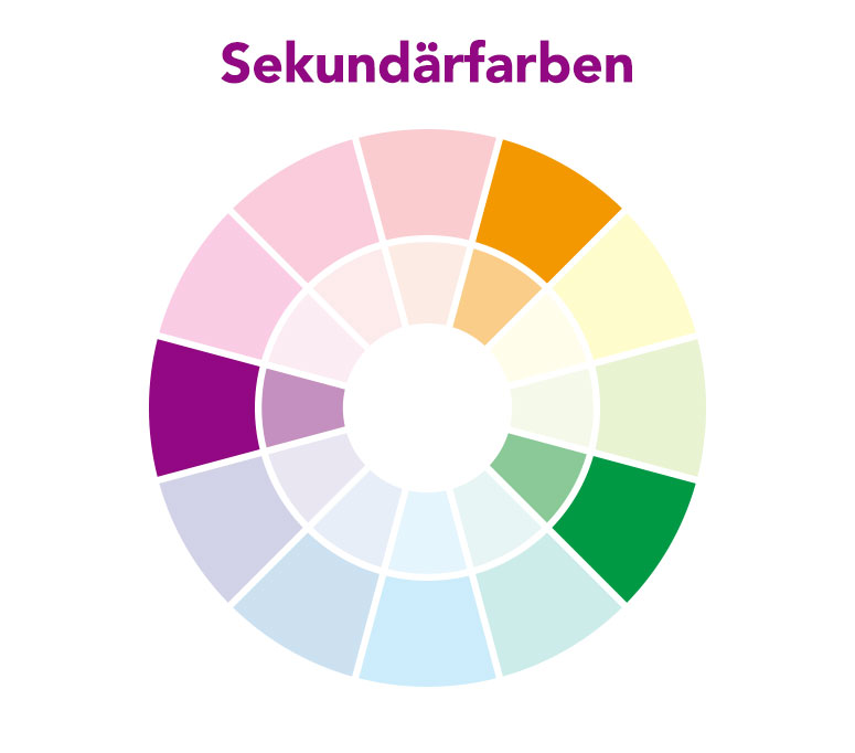
Secondary Colors are created by mixing two primary colors. The secondary colors are green, orange, and violet.
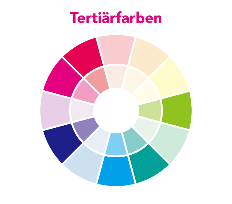
Tertiary Colors are formed by mixing a primary color with a secondary color. For example, yellow-green is created by mixing yellow and green.
Experimenting with colors plays a crucial role in developing the necessary skills. Practical experience with different colors, regardless of the artistic field—be it design and typography, photography, or painting—is indispensable.
The Science of Complementary Colors
The use of complementary colors in design projects and photography can make a significant impact. They can draw the viewer’s attention to specific elements and create a harmonious and balanced aesthetic.
Complementary colors can also help influence the mood or atmosphere of a design. For example, using warm complementary colors like red and orange can create an energetic and passionate mood, while cool complementary colors like blue and green can convey a calming and relaxed atmosphere.
There are various color schemes (color concepts, color styles), including monochromatic, complementary, analogous, triadic, and tetradic color schemes.
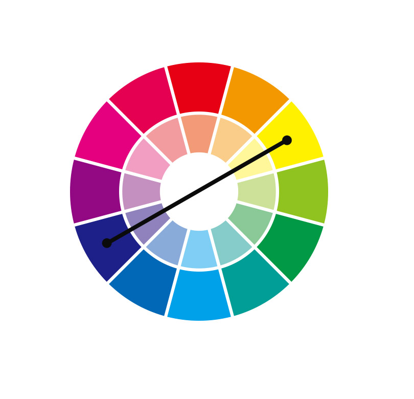
Complementary Colors are colors that are opposite each other on the color wheel and, when combined, create a strong contrast.
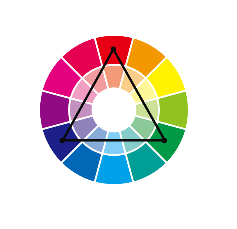
Triadic Color Scheme (Triad, Three-Color Scheme) is a color combination based on three colors that are evenly spaced around the color wheel, creating a balanced visual effect.
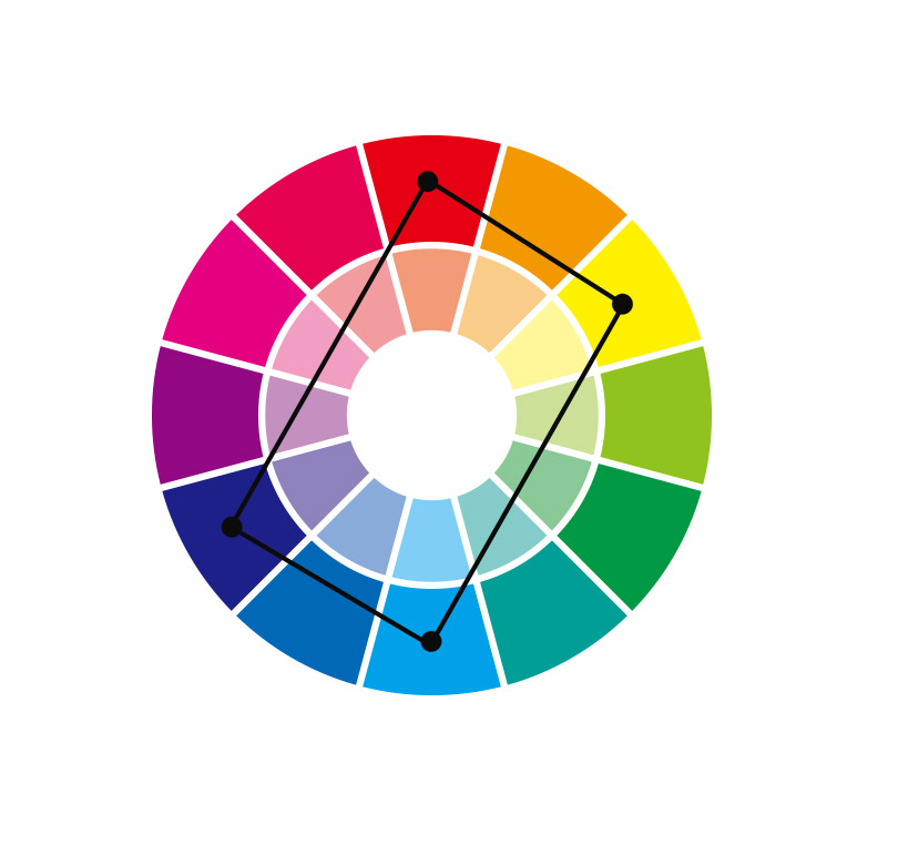
Tetradic Color Scheme (Quadradic, Four-Color Scheme) is a color scheme based on the selection of four colors, using two pairs of complementary colors to create a harmonious yet vibrant palette.
Color Schemes in Photography
Below, I will show examples of how to work with a complementary color scheme and a tetradic color scheme in photography:
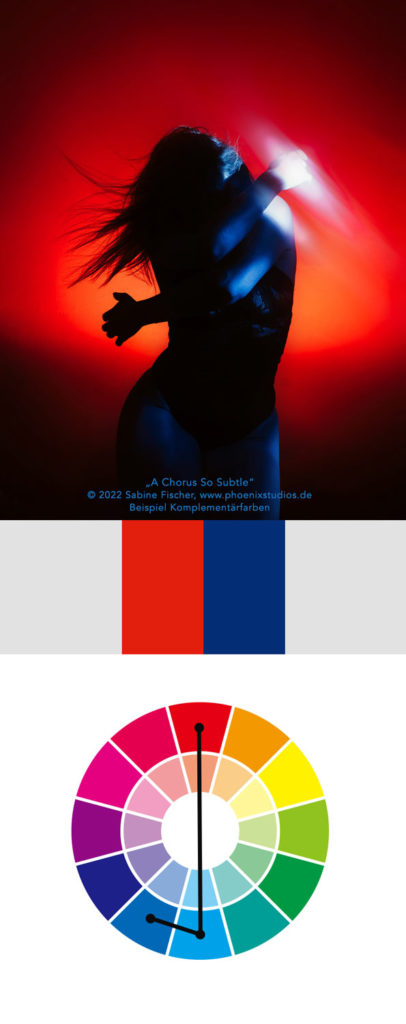
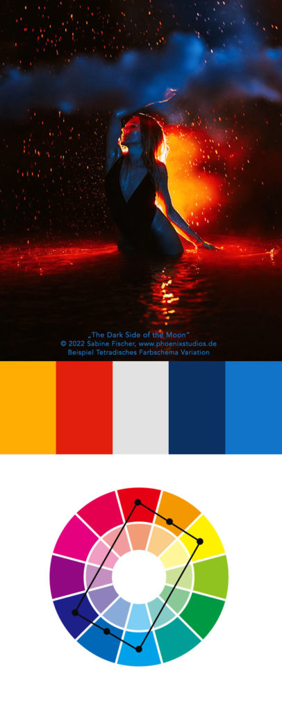
Photos: Self-Portraits © 2022 Sabine Fischer www.phoenixstudios.de
Tetradic Color Scheme
Now, let’s dive into the most interesting and simultaneously most complex color scheme: the tetradic color scheme, and demonstrate through examples how using bolder colors can bring more vibrancy and complexity to images.
The tetradic color scheme is an advanced method of color combination that uses four or more colors in an ideally harmonious arrangement. In this technique, you select two primary colors and their complementary colors from the color wheel. However, analogous (neighboring) colors can also be incorporated. While there are rules, they are more guidelines than fixed procedures, as this approach encourages flexibility and creative freedom.
By embracing a tetradic scheme, you can introduce richness into your compositions. The balance of warm and cool colors offers a diverse yet cohesive aesthetic, where complementary pairs (such as red and green, blue and orange) create contrast and energy, while analogous colors (such as yellow and yellow-orange) can provide subtle transitions and harmony.
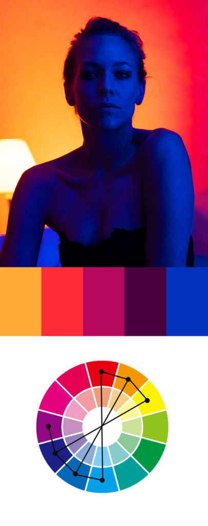
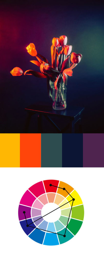
Photos © 2022 Sabine Fischer www.phoenixstudios.de
The Tetradic Variation
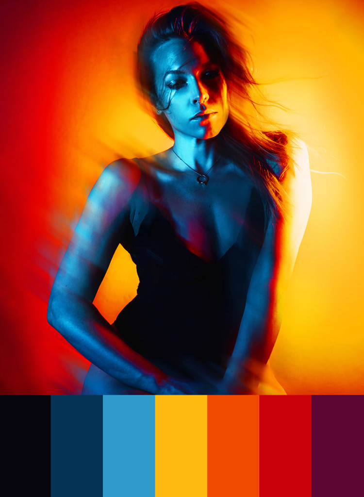
In this self-portrait there are some complementary colors present. Orange is opposite blue, and yellow is opposite purple. Additionally, the analogous colors (the neighboring colors) are also present in this image. Thus, this is clearly a tetradic color scheme, more specifically a tetradic (sub)variation. It’s tetradic color scheme 2.0. It appears vibrant and lively. The most challenging aspect of this color scheme is to give the image a harmonious effect despite the three complementary contrasts.
Photo: Selbstportrait, © 2021 Sabine Fischer www.phoenixstudios.de.
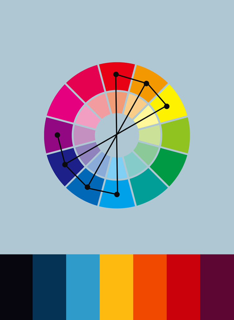
In my view, a tetradic variation is a version that contains two or more pairs of complementary colors. If you look closely at the colors in this image, you can see how complex the colors are—opposite each other, yet interconnected:
Three pairs (instead of just two pairs, as in the basic version of the tetradic color scheme) of complementary colors. Analogous (next to each other) and complementary (opposite each other).
Common Mistakes When Using Complementary Colors
Overusing High Contrast: While complementary colors create strong contrast, overusing them can make an image feel jarring or overwhelming. It’s important to find a balance and use one of the complementary colors as the dominant color, while the other serves as an accent.
Not Considering Saturation and Brightness: Using highly saturated complementary colors can sometimes cause visual tension. It’s essential to adjust the brightness and saturation of one or both colors to create a more harmonious effect.
Ignoring Color Proportions: The equal use of complementary colors can lead to an unbalanced composition. It’s crucial to ensure that one color dominates the design, while the complementary color is used sparingly to highlight certain areas.
Lack of Visual Harmony: While complementary colors provide contrast, they need to work together cohesively. Not considering how the colors interact with each other in terms of hue, tone, and placement can lead to visual disharmony.
Forgetting Context and Mood: Different combinations of complementary colors can evoke various emotional responses. For example, red and green can feel festive, but in other contexts, it may feel overly harsh. It’s important to consider the mood you want to create before choosing complementary colors.
Overlooking the Background and Foreground Balance: When using complementary colors, especially in photography or design, it’s easy to forget to balance the background and foreground colors. The contrast between these elements should not clash but rather complement each other to maintain visual interest.
Clashing with Natural Color Perception: Sometimes, complementary color pairings don’t work well in certain settings, especially if they don’t align with natural color perceptions. For example, natural landscapes often have subtle, harmonious transitions rather than sharp contrasts, which can make using complementary colors feel out of place.
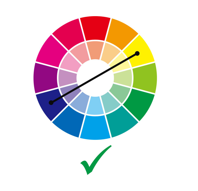
Some color pairings can be very harsh on the eyes and have a negative impact on the viewer. When it comes to graphic design, a good example of effective and ineffective color contrasts can be seen with the complementary colors chosen here:


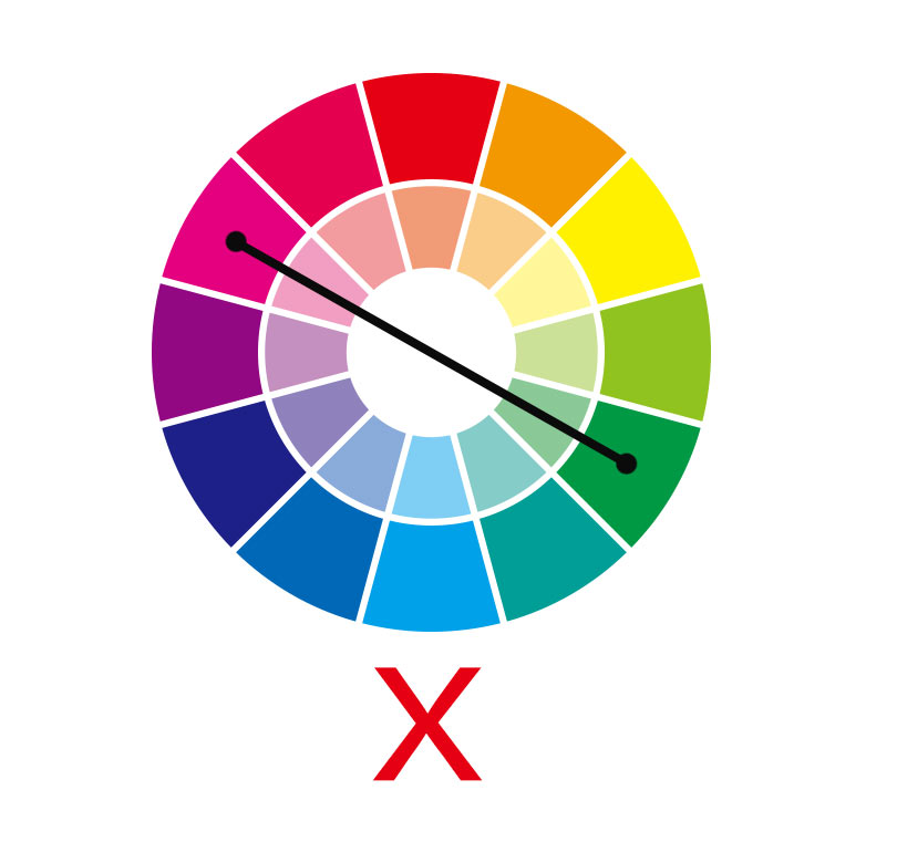
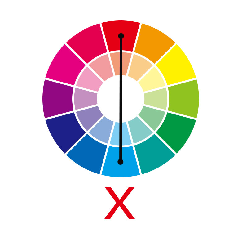
The first two color combinations (magenta and green) clash and are not recommended for a pleasant and harmonious color display. They create a visual discomfort that can strain the eyes. Similarly, light blue on a rich red background feels like stepping into a website from the ’90s—it’s almost painful to look at.
On the other hand, the contrast between dark blue and yellow works excellently for eye-catching and high-contrast designs. The yellow text is bright enough against the dark blue background, making it clear and readable. This principle applies similarly to other complementary colors: the contrast should be high enough to ensure that the eye can comfortably process the colors without strain.
Colors like blue and orange or red and green can work well when used thoughtfully. These combinations create balance while drawing attention to important elements, especially when one color is used more subtly as an accent.
Gradients are an excellent way to make ineffective complementary color combinations more visually pleasing, especially in photography. By smoothly transitioning between two complementary colors, gradients soften the stark contrast, making the colors blend more harmoniously and less jarring to the eye:

The eye has enough time to adjust to the color change through the gradients from one color to another. There are hardly any harsh contrasts like in the typography examples above. This means: In my opinion, it is recommended to use gradients between ineffective complementary colors and to avoid having the non-functional complementary colors touch directly.
I recommend that every creative mind engage with color schemes, contrasts, and complementary colors. This can help develop a better understanding and feel for the different colors.
